Today, eCommerce brands are becoming innovative and bolder with their practices for eCommerce web design. It helps them stay competitive and present their brand story in the most humane way possible. Still, many don’t really pay heed to their web design.
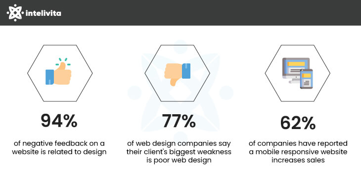
Research has shown that the biggest weakness of 77% websites is their poor design and 94% leave negative feedback for the same. But how can brands turn this upside down?

The current user demands and online shopping patterns greatly influence your eCommerce web design elements. Due to this, the design space is evolving, and brands need to leverage the latest eCommerce website development and design tips and trends to stay afloat.
Here are the top 9 eCommerce website design tips that can help bring more traffic, leads, and conversions to your eCommerce brand.
Here we present the most trendy practices for eCommerce web design that you must follow to bolster your eCommerce brand and boost revenue.
As per Goodfirms Research, 84.6% of web designers believe crowded design is the most common mistake small and medium businesses make.
One approach you can take to avert making such a grave mistake is using a minimalist design. Minimalism does not mean you shouldn’t include images, videos, catchy colours, or other visuals. Minimalism simply means not overemphasise it in your design.
The minimalist design focuses more on aesthetics, simplicity, and keeping the balance of alignment, symmetry, and contrast.
A few characteristics of minimalist eCommerce website design tips include appropriate use of whitespace or negative space, striking colours, and clean typography.
Here’s an example to take inspiration from:

Whitespace is a vital aspect of all as it helps users focus on important website elements. It makes your site easy to read, navigate, skim, and persuade users to take the necessary action.
Also, using striking colours and bold typography — which we’ll talk about in the next point — can help add meaning and clearly communicate your message.
A press release by Top Design Firms found nearly 40% of consumers appreciate the colours the most among other visual elements on a website. So, it makes sense to use striking and eye-catchy colours to draw customers in and increase sales for your website.
They are a powerful tool to ensure your eCommerce site has an optimal contrast when paired with a white or black background.
A jubilant colour scheme can add meaning and trigger emotions in users to click on the CTA.
Similarly, bold and clean typography can help your eCommerce site stand apart from the competitors and ensure your message leaves a maximum impact.
The GoodFirms report also mentions that 61.5% of web designers lean toward expressive typography.
Let’s see an example for the same:

Here the colours are punchy and easily catch users’ attention. Moreover, the typography is also on point. Thus, these powerful tools are the backbone of your eCommerce web design for conversions.
Visuals do increase conversions! They are one of the supreme eCommerce web design elements for bringing more sales.
As per the Justuno report, 93% of customers consider visual appearance a key deciding factor while purchasing.
This is because online shoppers don’t have the luxury of seeing and feeling products, as is the case with offline shopping. Here, customers rely more on product visuals to determine its quality and make decisions.
An article on product photography found that good quality and relevant images can increase conversion rate by 30%.
Creating professional visuals and images of your eCommerce products has become so effortless today. All you need is a good camera or smartphone, great lighting, a tripod, and a table with white sheets. All these tools won’t add much cost to your eCommerce website design and development.
Further, all these tools will enable you to click pictures from various angles and even include 360 videos to build trust and confidence in your customers. Here’s an example of 360 video:

Bottom line is having plenty of high-quality images and other visual types can really bring you more sales.
By taking a storytelling approach when writing copy for your eCommerce website or product description, you can bring life to your products. Stories carry the power of connecting users emotionally with your brand and earn credibility and trust from consumers. The research has also proven the same.
Adopting this practice for eCommerce UI/UX web design will give you an edge over the rest of your competitors. You can highlight the best features in your eCommerce website of your products in an engaging way and bring out the passion for your products.
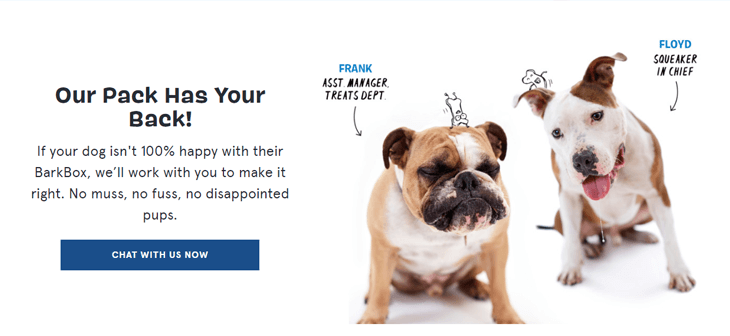
Here’s an example how Barkbox does it:

Another thing you want to do is highlight the pain points users regularly face and describe how your products can help resolve them. Finally, stress more on the benefits while writing copy; it’ll surely help you improve conversions and revenue for your brand.
Navigation is an important eCommerce website design tip to give users a good browsing experience. Clever page transitions or animated transitions are going mainstream in 2022.
Such type of navigation is sure to improve the user experience and bolster your eCommerce website design.
Once the shoppers visit your website, they’ll enjoy and love spending time navigating through various products or categories. This would translate to users spending more time on your website and is actually good for your website's SEO.
Also, remember that the navigation menu should always be within users’ reach, and it shouldn’t take them more than three clicks to find what they are looking for. And finally, don’t load up too many menus as it will clutter your design, confuse users, and force them to leave without conversion.
Micro animations can power up your eCommerce web design. They are small and functional animations that inform users of the tasks by giving visual feedback. The proper utilisation of micro animations can help explain things visually without needing words.
As seen in the below graphics, the shape of the hamburger menu icon changes when users click once. Also, it shows what action would take place if they click it again.

Research has shown that 62% of eCommerce owners experienced increased sales for their mobile-responsive sites. Moreover, mobile and tablet devices hold over 50% of the market share in the UK, which means your website is likely visited by mobile users.
Thus, it makes sense to incorporate eCommerce web design for mobile. Another reason is that Google prefers positioning mobile-friendly websites at the top of search engine result pages.
Making your website fully responsive for mobile devices can help you capture more traffic, leads, and conversions. Responsive eCommerce web design for mobile also allows your eCommerce website to adapt to any screen type or size to provide a flawless experience.
Thus, the bottom line is that mobile optimisation can unlock greater success and improve the conversion ratio for your eCommerce brand.
Consumers want to buy from established and reputed brands and not from some faceless scouts. Thus, prioritise eCommerce branding above all to sustain your business for longer.
By branding, we mean to build trust among your users that helps drive quality traffic and sales to your eCommerce site. It’s like a DNA imbibed into your eCommerce business which tells users what makes you a company, and above all, how they can distinguish you from the rest of the competitors.
eCommerce branding goes beyond just slapping a slogan, or a logo for that matter. The biggest part of it is to build relations and connect with your audience to drive more sales. And for the same, you must also refine your practices for eCommerce web design and infuse branding elements into it.
How can you do so? Well, try answering the following questions:
Once you get the answers, you’ll be on your way to building an eCommerce brand that people will love and trust for all their purchases.
Social proof is nothing but what others say about their experience with your eCommerce brand. It can be in the form of reviews, ratings, testimonials, recommendations, video reviews, etc. A research finding says about 89% of consumers in the UK read reviews regularly or always.
Moreover, 98% of UK consumers consider reviews an essential resource before purchasing. Thus, it’s safe to say that reviews hold tremendous value for consumers and brands alike. So make it a priority to collect and display such value adding content.
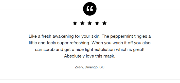
Here’s an example of effective utilisation of space for adding social proof:

It surely is beneficial and helps build trust among your potential customers. The best place to showcase positive feedback is on product pages to attract a high volume of visitors. Regarding the review collection, create a strategy to ask customers to leave reviews and incentivise them to do so if you have to.
In a nutshell, brands that incorporate social proof into their design strategy will win customers over. And brands that don’t, will lose out on high conversion.
eCommerce web design for conversions is a bit tricky, considering you first need to build trust, relationships, and connections with your consumers. However, the tips and best practices for eCommerce web design mentioned above can redefine your brand identity and convert users like crazy.
Taking a minimalist approach is the first step to building your brand. Also, the colours, typography, relevant product visuals, clever navigation, and mobile optimisation play a vital role in building a customer-centric website.
While it can seem a bit overwhelming, taking help from an expert design team such as Intelivita can be a wise decision. We have a competent team of web designers with ironclad proficiency and rich experience in delivering top-notch eCommerce design solutions.
Contact us to consult our experts for your eCommerce website design for conversion requirements.
Get in touch with us